Rok:
2020
Kategoria:
Branding, Identyfikacja wizualna
2020
Kategoria:
Branding, Identyfikacja wizualna
/About
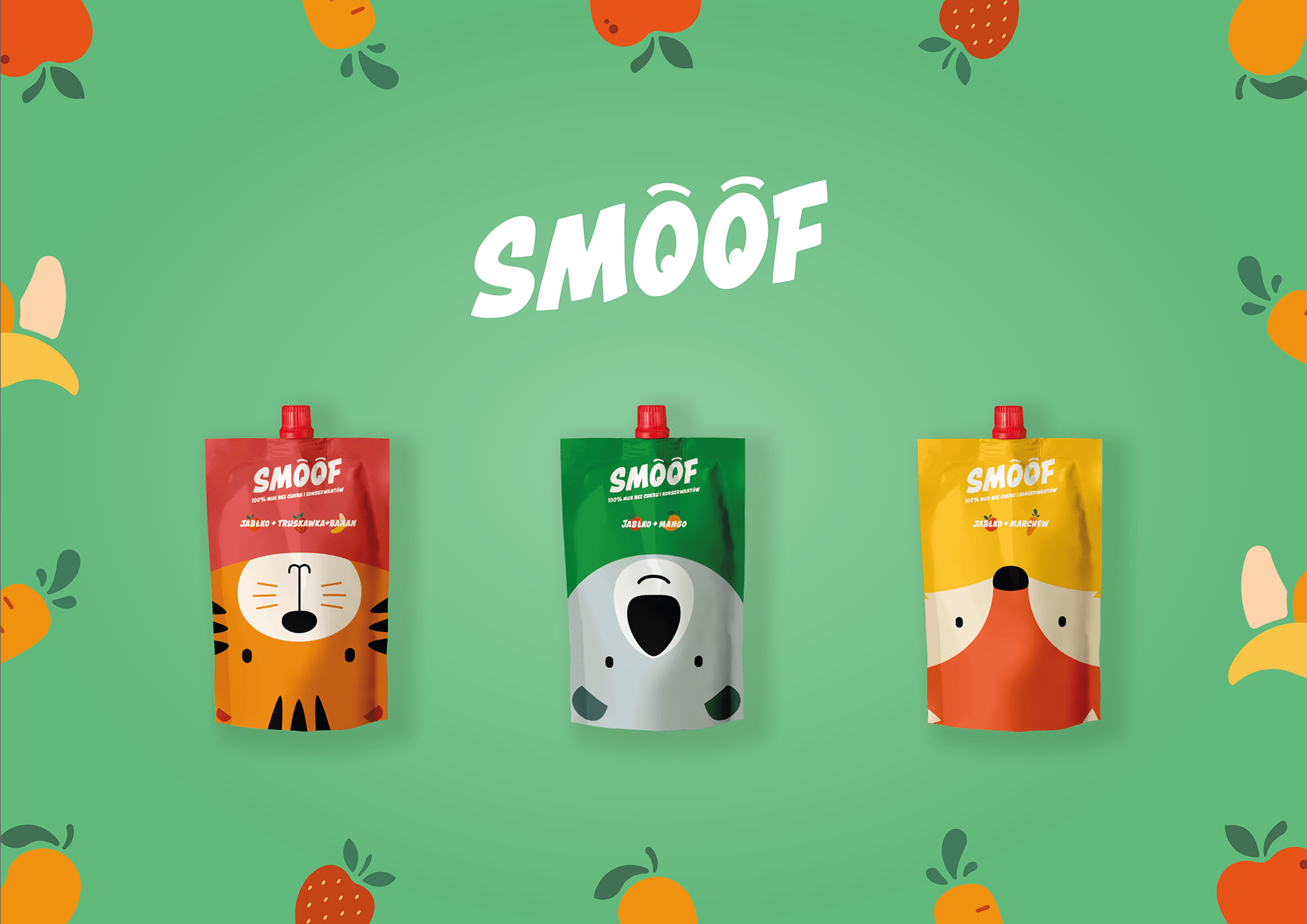
SMOOF is a new brand that produces smoothie pouches for kids. Our task was to name the brand, design logo and packaging design for different flavors. „SMOOF” comes from word smooth (considering the consintency) and writing it literally as we hear it in polish language (where the products are sold).

/Design
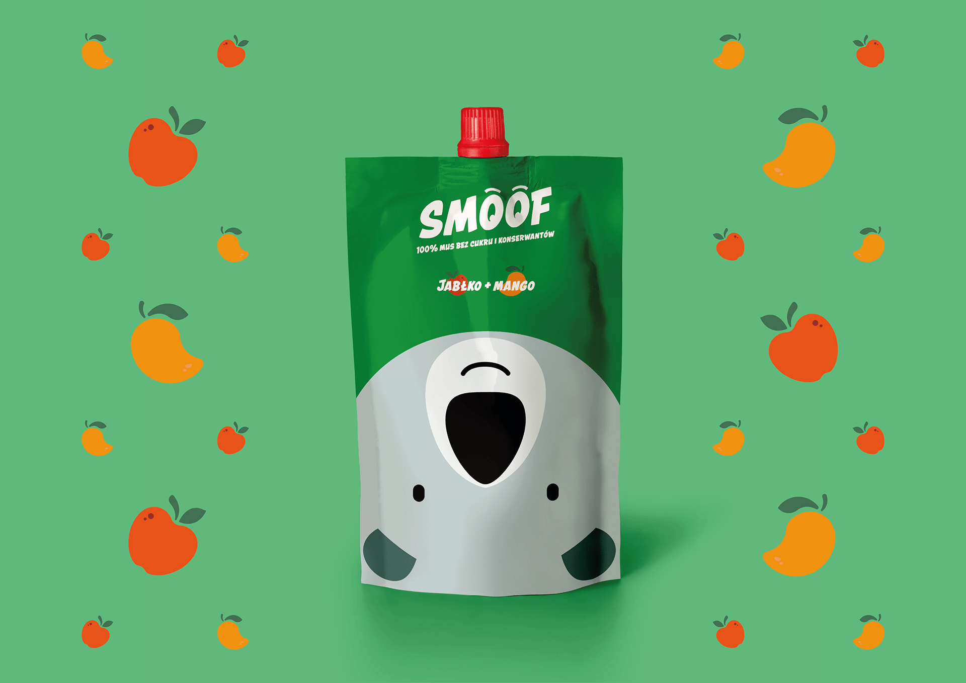
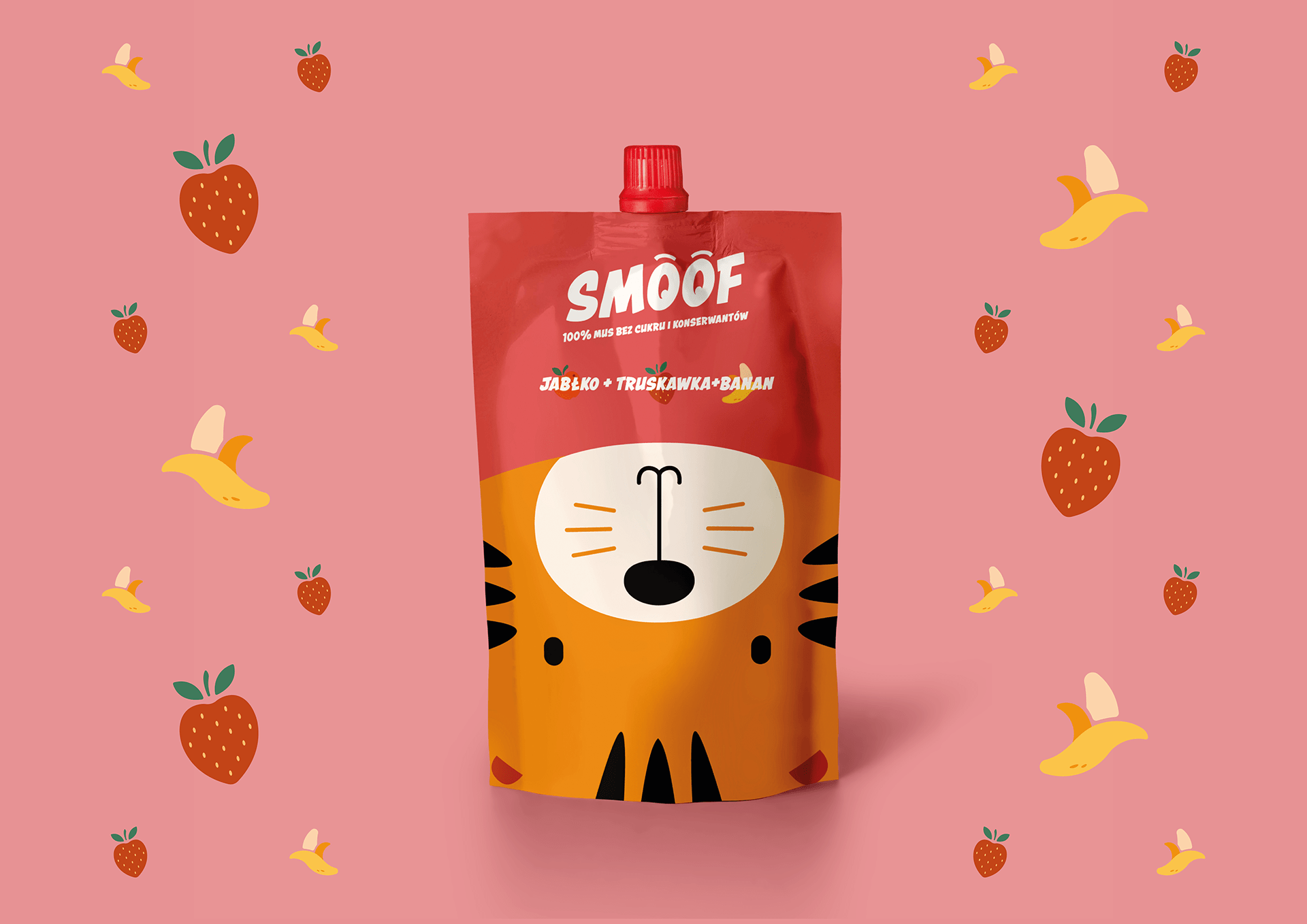
We have designed an illustrative packaging with different animals accompanied with dynamic lettering and vivid colors. Playful logo design has opened eyes as the letter „O” their purpose is to look at the client and attract his attention. After consumption, we can put them upside down on the cork to have a better look at the animals. We can also try to collect the entire set of animals! 🙂


